-
Sydney Philharmonia Choirs is Australia’s largest choral arts organisation, occupying a unique position within the Sydney’s cultural and historic landscape.
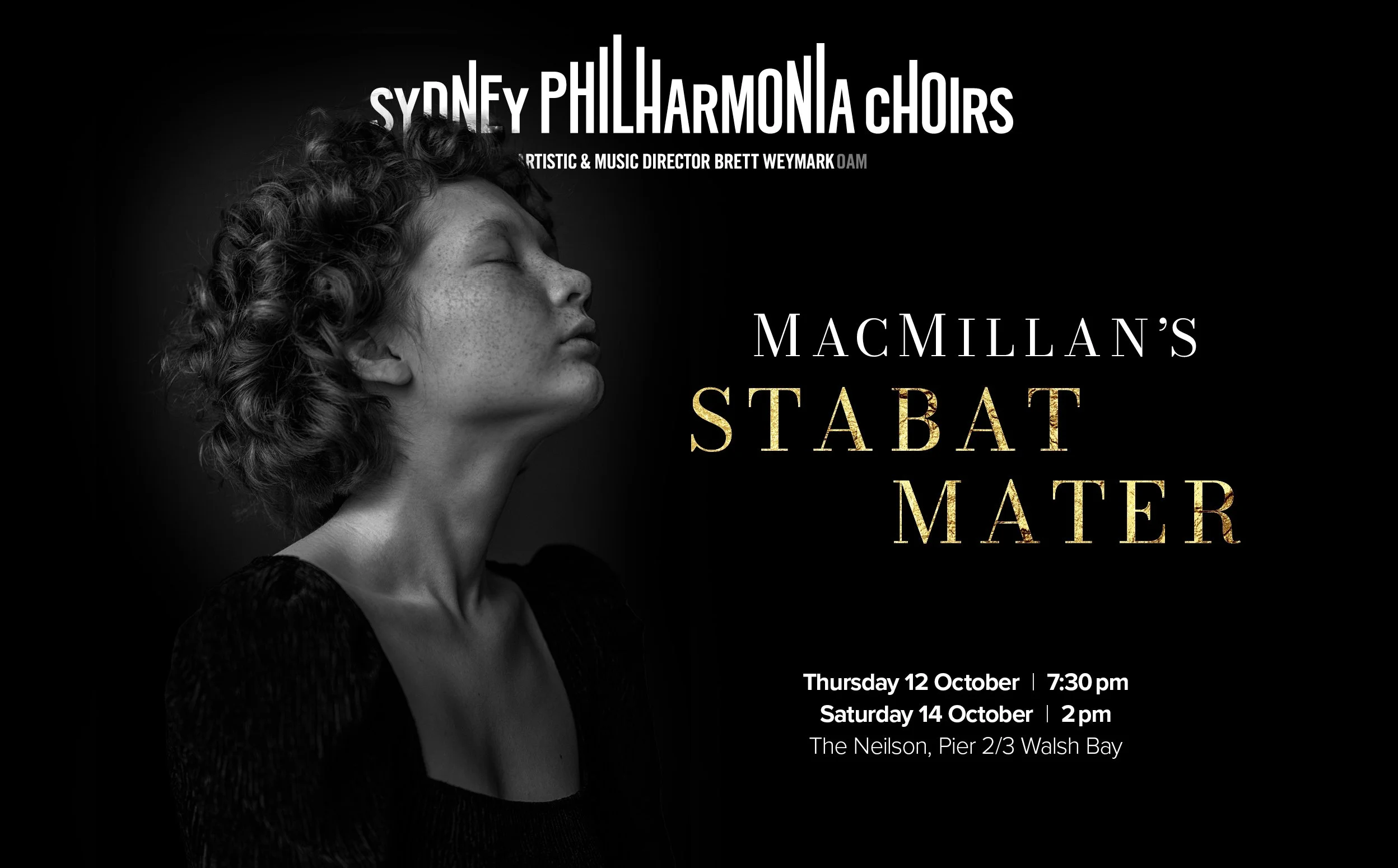
For the past few years, the Choirs had stuck to the same formula for promoting their performances. Step 1: find a good shot of a chorister or conductor – either performing, or posed on the steps of the Opera House. Step 2: make them the face on the poster.
When Smorgasbord was invited to brand their 2023 season, we were curious to see what might happen if we pushed beyond this literal approach.
This was our thinking: a night with the Choirs deserved to be positioned as a peak experience. A chance for concertgoers to take their place in the darkened concert hall and hear rare artistry. To fall under the spell of exquisite voices and feel the goosebumps rise.
To convey this, we found imagery that provoked emotion. Sensuous. Dramatic. Transcendent. We borrowed key visual cues – a classic typeface, rich accents of gold – from another industry that deals in peak artistry and drama: the world of couture fashion. And the Choirs’ logo was run at the top of every piece, big and bold, like a glossy magazine masthead.
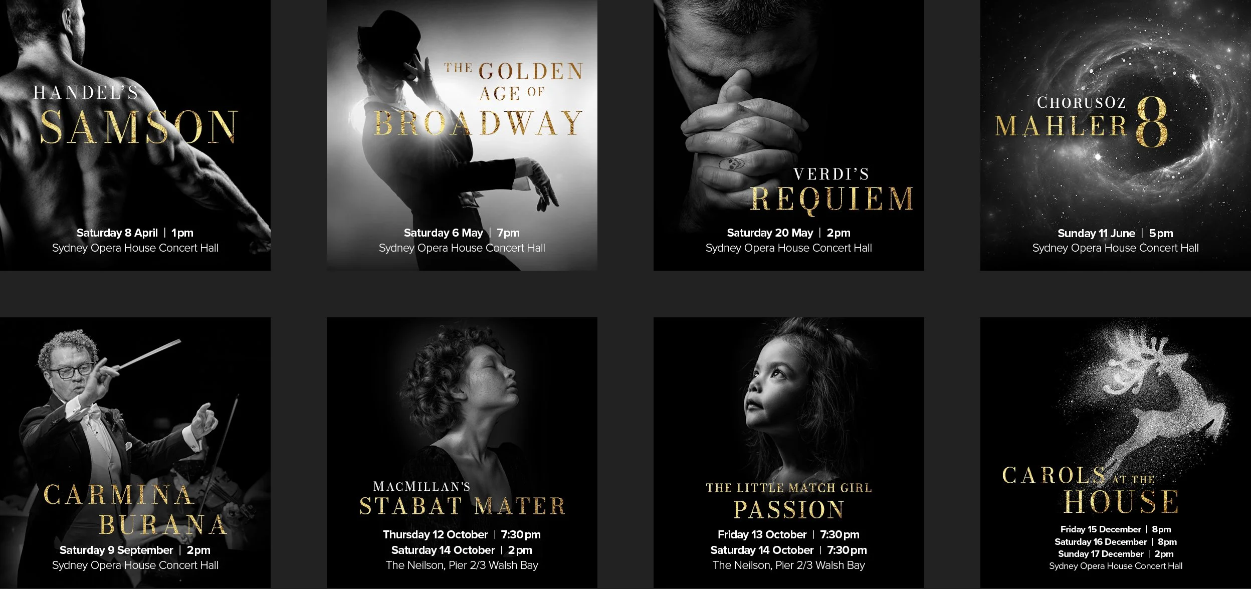
This recipe was repeated for all of the nine programs in the season, to take advantage of the cumulative effect of repetition in building brand awareness.
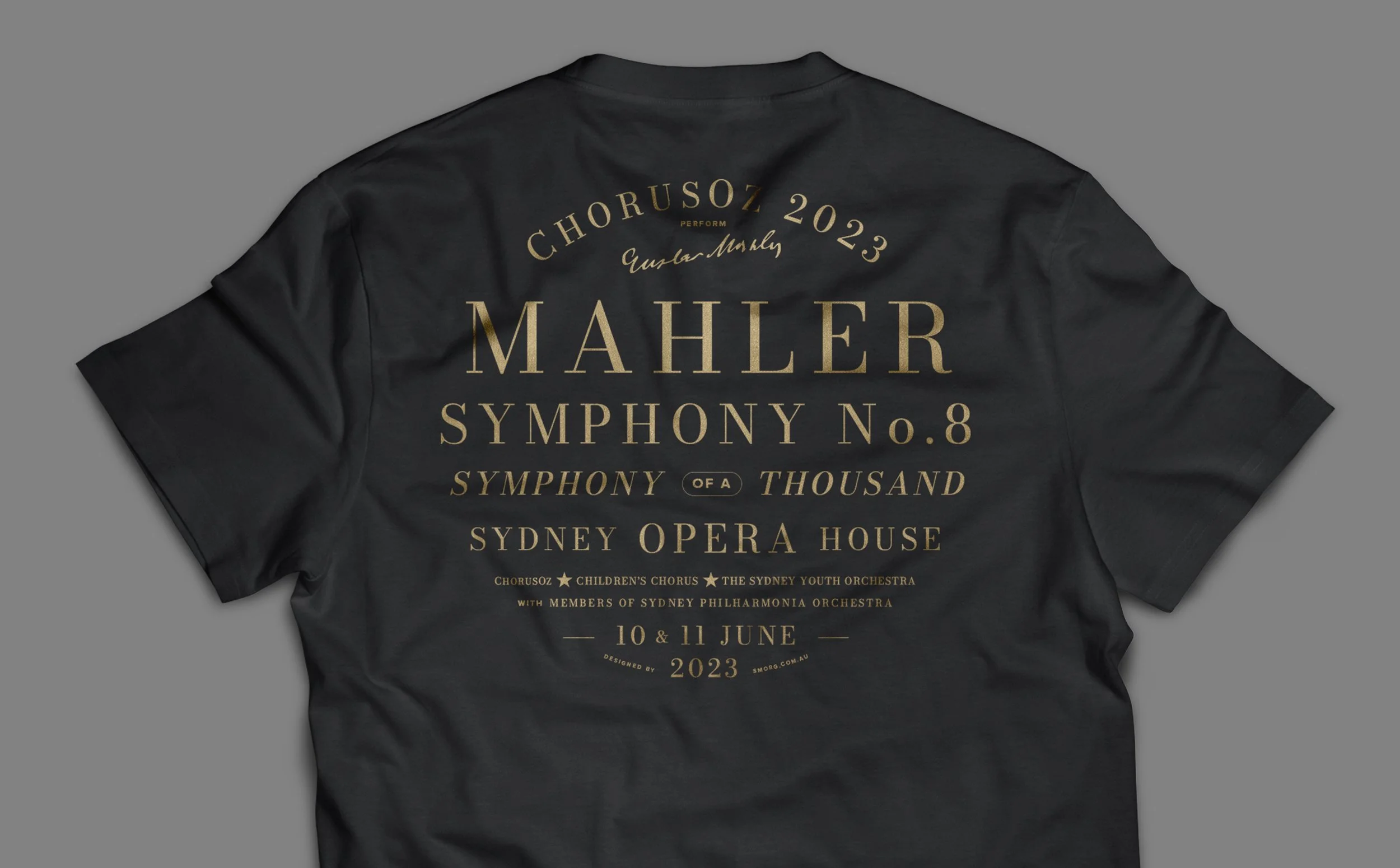
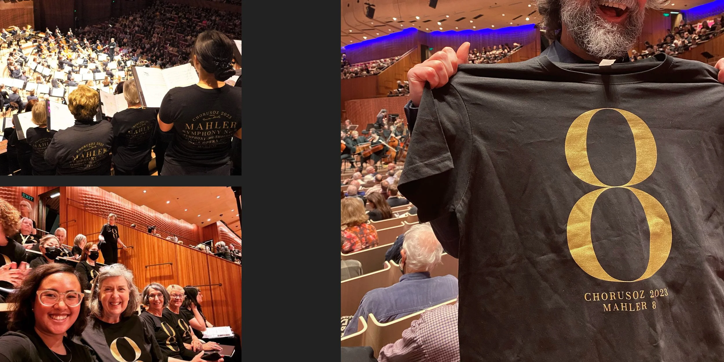
It also extended to branding the biggest event of the Choirs’ year – a performance of Mahler’s Eighth Symphony, which called for a thousand performers to pack the Opera House’s largest stage. A logistical behemoth, and a plum opportunity to use the power of massed graphics. Rows and rows of ‘8’ t-shirts became a striking visual counterpart to the symphony’s thunderous score. Even though we’d never overstate the allure of a sexy black t-shirt, it’s true that the following year’s ChorusOz event was way more popular than expected, reaching 100% of its target numbers four months earlier than forecast. Hmmmm. Coincidence? ;-)