-
Imagine a rural property on the western fringes of Sydney, where fruit and vegetables are quietly tended and retired racehorses shelter on the grassy slopes and gullies.
This is Cana Farm.
While Cana is run as a working farm, it’s also a social enterprise. It offers a place for anyone who’s had a brush with the justice system or social services to take stock while they find their feet again.
If you’re a Cana regular, one option for your vocational training is to transform the farm’s harvest into a range of gourmet goods for sale through their ‘cellar door’ and website.
When we were asked to redesign their packaging, we realised we first had to answer an important question: what kind of design solution would do justice to the people of Cana?
After all, it’s easy to walk down any supermarket shelf and find a dozen similar products, and note how many of their labels sport cheery Mediterranean scenes or a glossy, minimalist aesthetic. Falling back on the usual design tropes just wouldn’t cut it for Cana. It wouldn’t be true to the reality of the place.
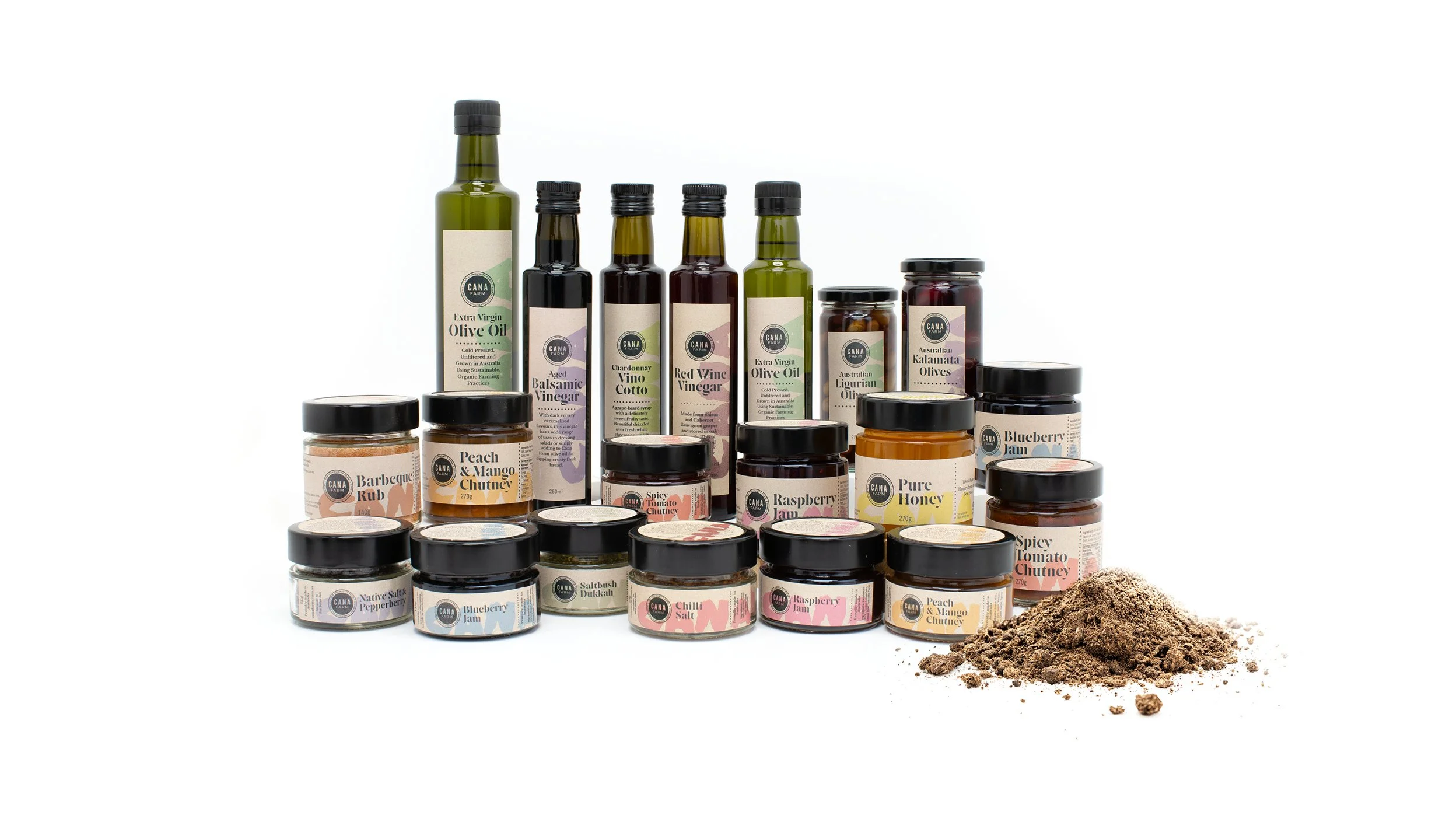
So perhaps it wasn’t a surprise that the solution was found by simply paying attention to the farm itself.
We used dotted lines because of the way they suggested rows of old nail holes in the galvanised iron roof. A stencil font was a good match to faded lettering found in a former tool shed, and choosing kraft paper for the labels was a way to recall the texture of hessian and irongum fencing.
The best discovery was a wheelbarrow with a big bold ‘CANA’ painted on its side. This found its way, unchanged, into the background of every label.
The result is a design language that has a healthy respect for both rough edges and smaller sensitivities, as so many of the Cana crew seem to have too.
Thanks to Danielle Seisun, Julie Sneddon, Martin O’Loughlin and everyone at Cana for welcoming us and encouraging our explorations.
Product photography: Jacob Lopez, Dynamix