-
After years of working in the same public relations company, Jeremy Kirk and Antonino Blancato decided it was time to jump ship and start their own firm.
They phoned Smorgasbord eager to start on the nuts and bolts of their new brand – is a serif or sans serif better for our logo? – but, after hearing the tone of our creative director’s voice, agreed take a step back and spend a morning in a brand workshop first.
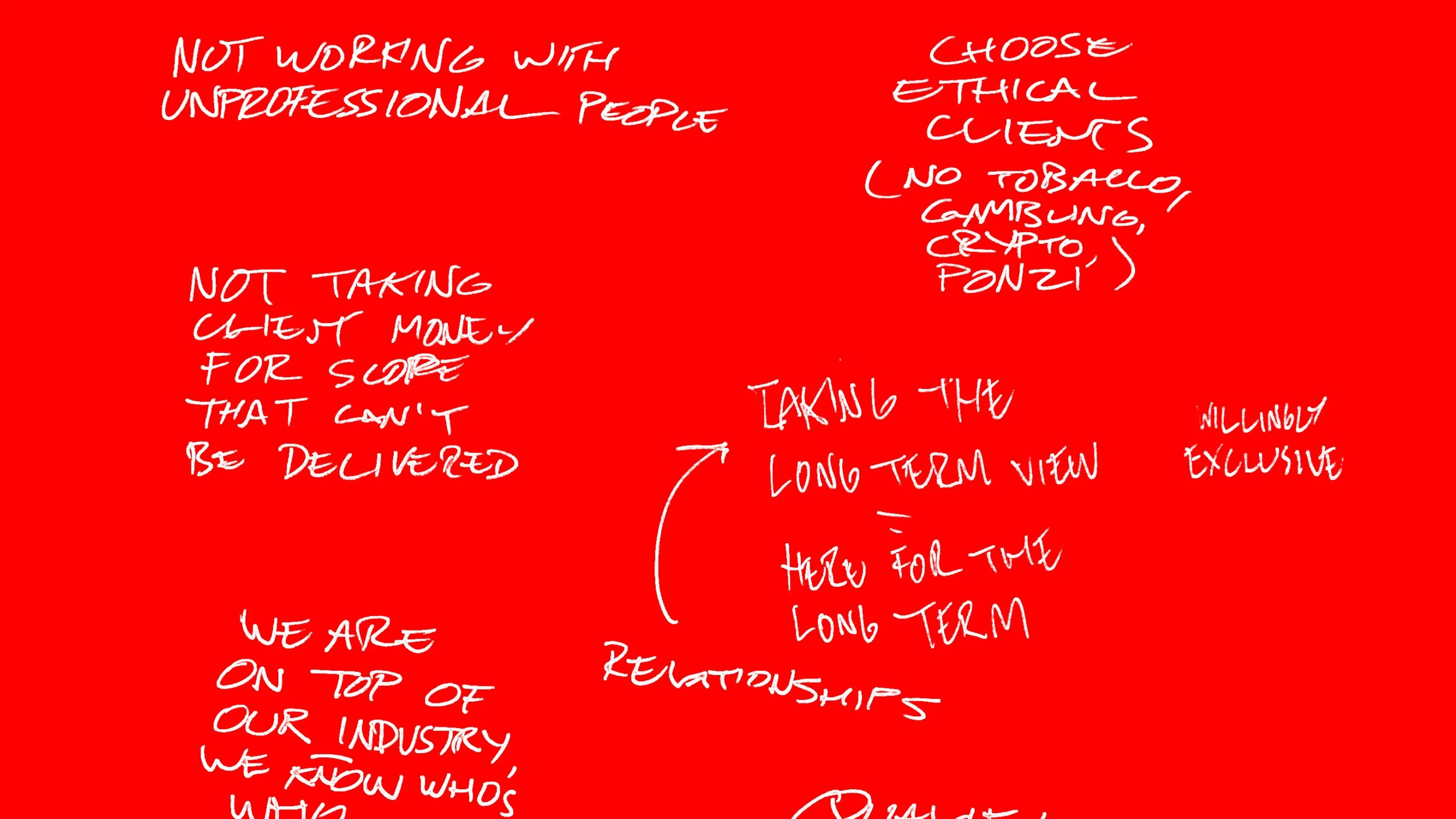
Brand workshops are incredibly useful. Through a structured series of exercises, they help business owners articulate the hidden logic of their brand. Who is your real target audience – and what do they want from you? What are your strengths that they’ll recognise? What is your purpose?
Only by clarifying what’s at a brand’s heart do you have any chance of hitting on an appropriate visual way to represent it.
Gradually, organically, the right logo took shape. A contemporary monogram with clean bold lines that was also a crest with a heraldic flavour. It captured KirkBlancato’s old-school commitment to a quality result, well delivered – but also evoked a modern, pared-back precision.
The symbol also spawned a number of variations that captured different aspects of KirkBlancato’s work ethic, which found their way into a video on the new website’s About Us page. A useful reminder of the strengths that had emerged in that first brand workshop.
But what really convinced Jeremy and Antonino that this logo was a solid solution? The hidden tribute to its founders. Turn it 90 degrees clockwise and you’ll see what we mean.


