-
Origin84 is a company offering IT support and strategy exclusively to businesses who use Macs. It’s a very specific niche, and, in the Australian context, an insanely brave business model.
“The first thing I wanted my branding to do” says Origin84’s founder, Michael Thomsen, “is to say that we are not like other IT companies.”
A radical business deserved a radical identity. Something as bold as what Apple decided to do in 1984.
Our solution began by finding ways to bake the 1984 date into the logo itself. We arrived at a 3D ‘O’ constructed from 84 rays, with its upper and lower halves tilted by 84 degrees. A symbol that suggested the solid presence and digital precision that are Origin84’s strengths.
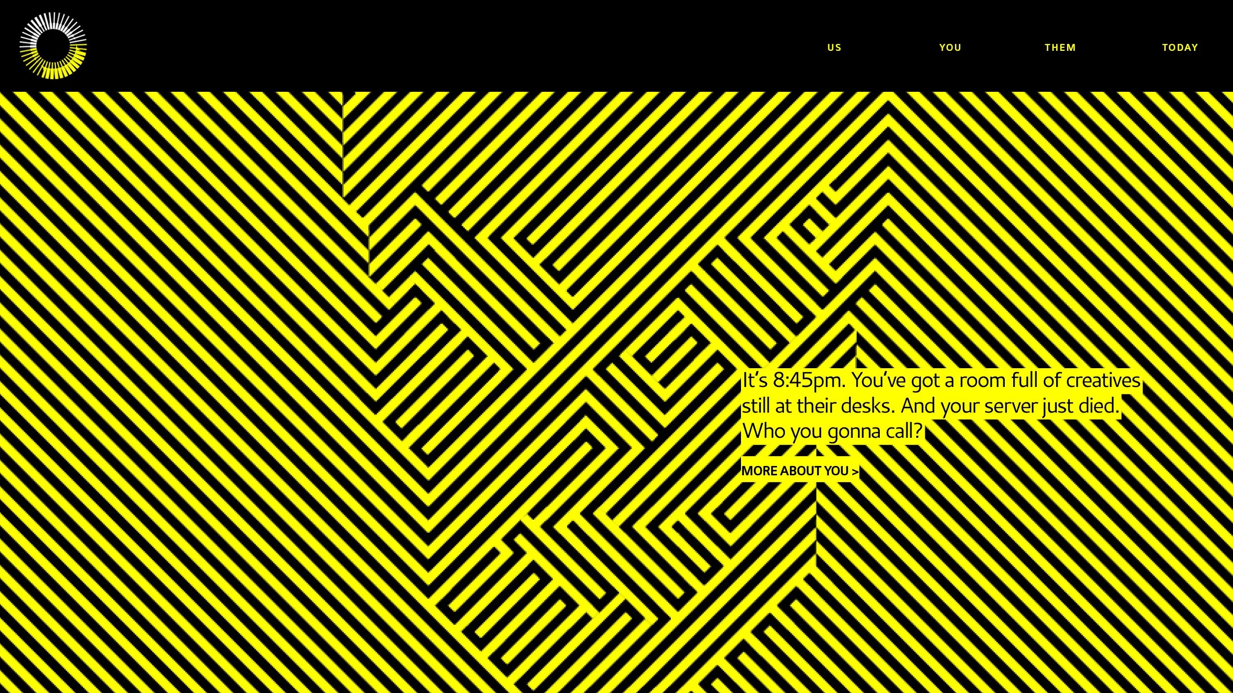
The strong palette of yellow, white and black carried over to the imagery. Rather than repeat IT industry clichés, such as photos of suited men gesturing vaguely at clouds of glowing icons, we chose high-contrast illustrations that dramatised the anxieties around IT.
We continue to help Origin84 find ways to blend the technical and the creative. The Origin84 Street Photography Project is an annual commission that challenges a photographer to bring a fresh perspective to the streets of Surry Hills – streets that Origin84 shares with its many clients in the creative industry.
Mick Thomsen is optimistic. “Committing to this look and feel has definitely been the right choice. Our clients are impressed that we’ve gone with an adventurous identity. It signals that we value creativity, and that’s great common ground to start an engagement with.”